We just made some improvements to managing your stuff in Google Reader to better enable doing lots of things at once. If Reader were a house, I guess we just knocked down a wall -- so you can finally get to the bathroom from the bedroom. (And we added a new patio while we were at it.)
A new settings page
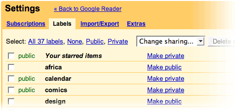
There's now a link in the top right that says "Settings". Clicking on that link opens up a new screen that lists all of your subscriptions and labels, and allows you to make edits to more than one item at a time. We've also added a bunch of new filtering and selection controls. And there's a new feature as well: you can rename any of your subscriptions.

Menus
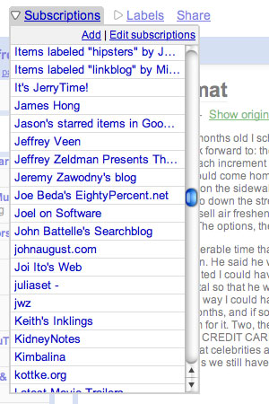
We've replaced the drawer on the front page with menus for subscriptions and labels. They're faster to load, especially if you have a lot of subscriptions. What's best, the menus allow you to select things without having to shove most of the application out of view.

You are probably already thinking of a number of cool things these changes could allow. You can probably imagine being able to sort subscriptions, or see what things have new stuff in them. Yep. We can too, and we'll be working on that stuff actively.
